


Click Code
Click Code is a professional, sustainable brand creating everyday computer accessories without compromising on value or performance.
Their accessories are designed to provide reliability, comfort and style, with a focus on precision and lasting performance.
Goal & Project Scope:
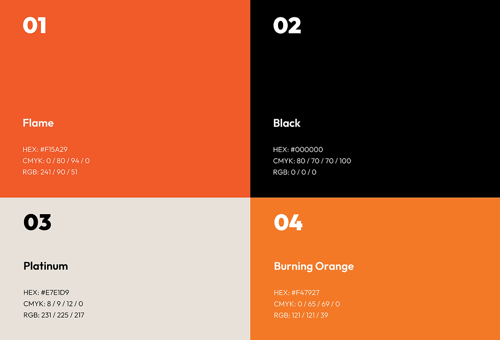
Create a simple, cost-effective and functional box design for the M492 Silent Wireless Computer Mouse. The packaging should feel like a modern tech product, with a clean, minimal and well-considered design using black [#000000] and orange [#f15a29].
The packaging should be protective & efficient for shipping and storage, easy to produce and budget-conscious, while reflecting the brand’s sustainable approach.
This self-initiated brief covers the core branding, material & design choices, explanations and relevant mockups.
The brand values include:
Professional
Modern
Quality
Honest
Sustainability
Affordable
Reliable
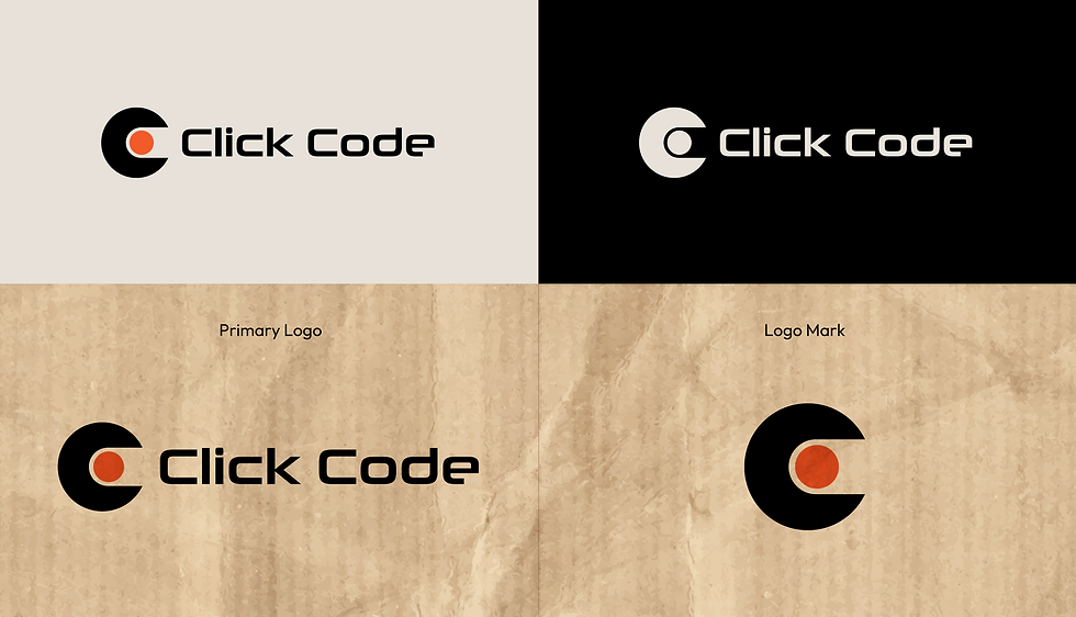

Cardboard provides a balance of protection, efficiency and simplicity, while being lightweight and recyclable.
The natural Kraft finish is left exposed, with minimal print and orange and black accents keeping the packaging clean and modern. Soy-based inks support the more sustainable approach.
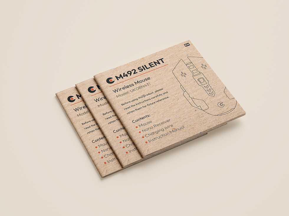

The Kraft paper manual uses the same material and visual style as the box packaging, keeping the overall look consistent.
The simple layout and annotated line art illustrations present the product information clearly, while keeping the design clean and easy to follow.

The internal box wrapping extends the visual identity into the unboxing experience, using the same pattern, colour and material.

Challenges & Outcome:
The key challenge was finding the right balance between visual impact, function and cost.
This meant making intentional choices around materials, print and colour, without relying on extra finishes or unnecessary packaging elements to make the design stand out.
Another challenge was creating a consistent look across the full product experience.
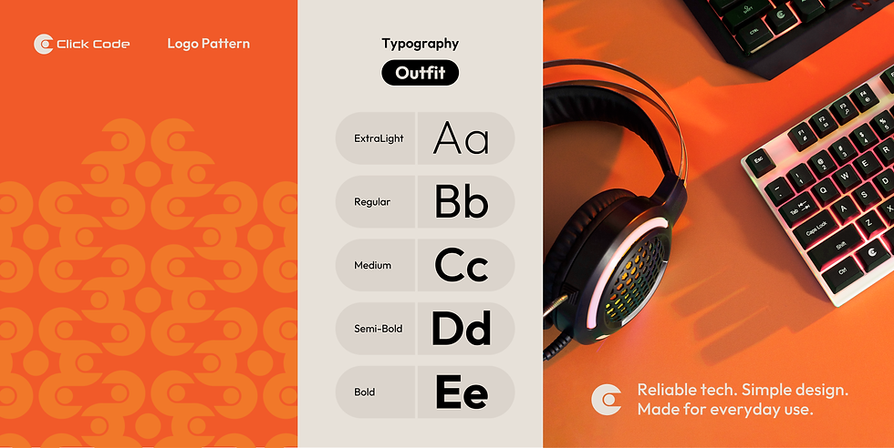
The box packaging became the starting point for a wider system, using the same colour palette, typography, pattern and illustration style across the mouse, mousemat, manual and internal wrapping.
Overview:
The project goes beyond the box design itself, covering the brand identity, packaging, product manual, internal wrapping and mockups.
Working across each part helped me learn how to keep a visual system consistent across different formats, while making sure each element has a clear purpose.
It also showed me the value of keeping things simple and well considered.
